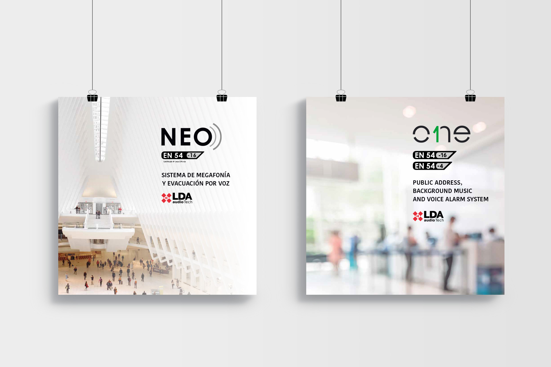
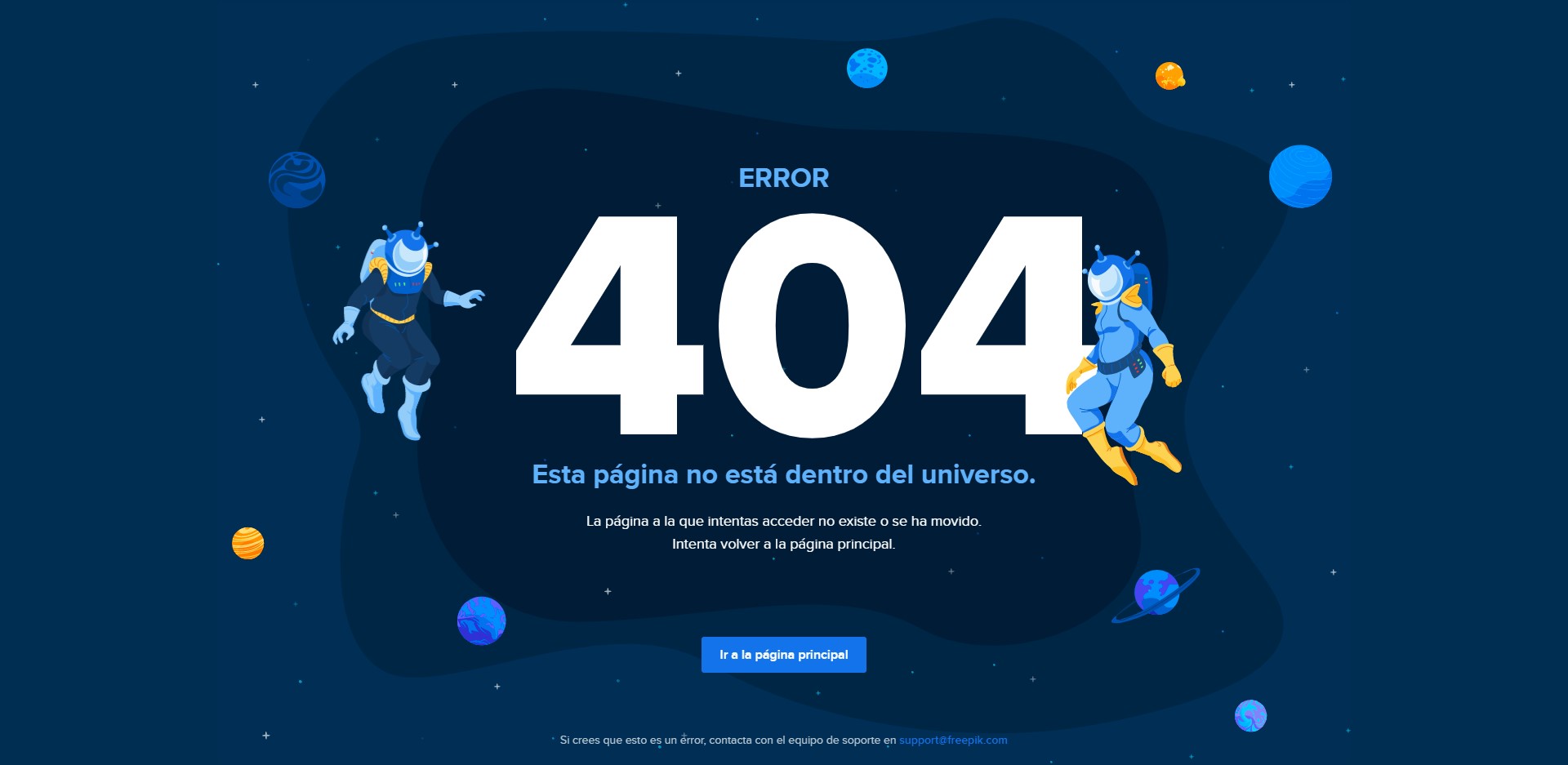
404 Pages
Adjusting voice and tone
Personal project for a UX Writing course.
Rol: UX Writer.

Starting point
The 404 error page is a unique opportunity to start a conversation with the user. It’s the moment when a brand’s voice comes through most clearly, and the ability to smooth over this friction point with the right tone can make the difference between a good and a bad experience.
The challenge
Design the 404 page for three companies with distinct brand voices.
Working approach
For this project I chose three different organisations with one thing in common: their interaction with users is particularly valuable for delivering added value and building their brand identity.
Freepik (now Magnific) is a startup offering free and premium graphic resources for designers, creatives, and more. The brand encourages its users to develop their own creativity using the resources it provides..
TiendAnimal is Spain’s largest pet products e-commerce platform. Its goal is to help pet owners enjoy their animals by providing quality products, regardless of location, with record delivery times.
what3words is a geolocation system that allows any point on the map to be identified using a three-word phrase, easily shareable and accurate to a 3×3 metre square, even without an internet connection.
Each brand voice defines how it speaks to its users, and each situation calls for a specific tone that is consistent with that voice.
Voice and tone
To establish a solid theoretical framework, I used Jung’s archetypes to define the three brand voices, from which I then determined the appropriate tone for each 404 page:
Brand archetype: The Creator
Brand personality: Freepik is your resourceful friend, always there to help you bring ideas to life and develop your creativity.
Voice: Inspiring, positive, laid-back.
Tone by context: Confused user → Confident tone, reassuring. Frustrated user → Sincere tone, solution-focused.
Brand archetype: The Caregiver
Brand personality: TiendAnimal helps its customers make the most of their pets by giving them access to the quality products they need, wherever they are and with outstanding delivery times.
Voice: Warm, protective.
Tone by context: Confused user → Friendly tone, reassuring. Frustrated user → Informative tone, clarifying.
Brand archetype: The Sage
Brand personality: what3words helps you locate any place in the world by GPS using a tool that works in any situation, even without an internet connection.
Voice: Scientific, analytical, educational.
Tone by context: Confused user → Concise tone, straight to the point. Frustrated user → Solution-oriented tone.
The tool: the copy doc
For each project I produced a copy doc with all the information the UX, design, and development teams would need to take the project forward.

The new 404 pages
After analysing each brand’s value proposition and applying its voice with the tone appropriate to this specific friction point in the user experience, these are the three proposals I developed.

➔ We turned the error page into a marketing opportunity by giving users the chance to try the Freepik Stories tool.
➔ We used content (copy and visual elements) to reinforce the brand voice.
➔ We gave users the chance to get something useful out of a system error.

➔ We improved usability by providing clearer information about the error and reorganising the help elements in a more logical order.
➔ We used content (copy and visual elements) to reinforce the brand voice.

➔ We added value for the user by offering concrete options for resolving the error.
➔ We used content (copy and visual elements) to reinforce the brand voice.
Before and after
A comparison of the new 404 page proposals against the original examples.


Tools
- Google Docs
- Adobe Illustrator
- Chrome DevTools
Lessons learnt
On this project I learnt that brand consistency paves the way, and that you must always, always, always put yourself in someone else’s shoes to see things from their perspective. Empathy is one of the most powerful tools we have for designing content that is truly useful.